There are many interesting and exciting functions that are available for CSS 3 (Cascading Style Sheets). There are numerous additions to CSS 3 Like adding images to borders, adding shadow effects on text, adding multiple backgrounds and more. I will go through some of the new features in CSS 3, and try to uncover more though the blog as time goes by.
Multi-column layout
The CSS3 function for Multi-Column Layout allows the user to creating a design similar to a Newspaper layout. With designs of blogs and websites heading towards a magazine layout type of style I figured this is truly a helpful style to use.
Multi-column Layout Properties
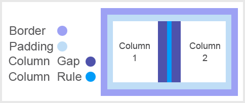
column-count: 3; this sets the number of columns for which the content will flow.
column-width: 1em; this property sets the width of each column.
column-rule: 1px solid black; this sets a border between the columns.
Code sample:
DIV {
width: 200px;
column-count: 2;
column-width: 100px;
column-gap: 10px
column-rule: 1px solid black;
}
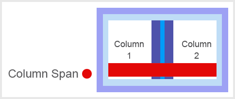
Now if you want to have something span across the columns that can be easily down with the column span property.
Code sample:
column-span: all; This allows objects (text/images/etc) to display through multiple columns.